

![]()

In addition to Weibo, there is also WeChat
Please pay attention

WeChat public account
AutoBeta


2024-11-17 Update From: AutoBeta autobeta NAV: AutoBeta > News >
Share
AutoBeta(AutoBeta.net)04/21 Report--
In recent years, in order to adapt to the development of the digital age, the pace of replacement of car labels by Chinese and foreign car companies has been accelerated. Last year, Volkswagen released a new VW logo, replacing the long-used three-dimensional car logo with a flat one. Not long ago, BMW also released the latest version of the LOGO, announcing that it has entered the era of flattening. In addition to the above car companies, BAIC New Energy, Changan Automobile, BYD, Beijing Hyundai and other car companies have also accelerated the pace of brand reshaping.
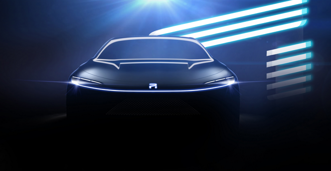
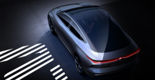
Roewe Motor, an independent brand of SAIC, is also speeding up the pace of brand reshaping. On April 20, SAIC Roewe unveiled a new R logo and its first flagship concept car, the Roewe R-Aura Concept, which is named "Aurora" in Chinese.

Roewe said that the new R standard will become the exclusive symbol of middle and high-end new energy models, covering Roewe new energy products, including MARVEL, car ER series all-series models, SUV is also under planning, R standard will take the lead in the flagship concept car Roewe R-Aura Concept.
As the first flagship model of the new R, Roewe R-Aura Concept adopts the design language of "collecting intelligence". The front face and tail of Roewe Pure Electric family adopt the design technique of "the Light of the World" for the first time, and the headlights are turned into a complete slender light band running through the front face, together with the inward rebate three-stage daily light group, which has a more sense of impact.
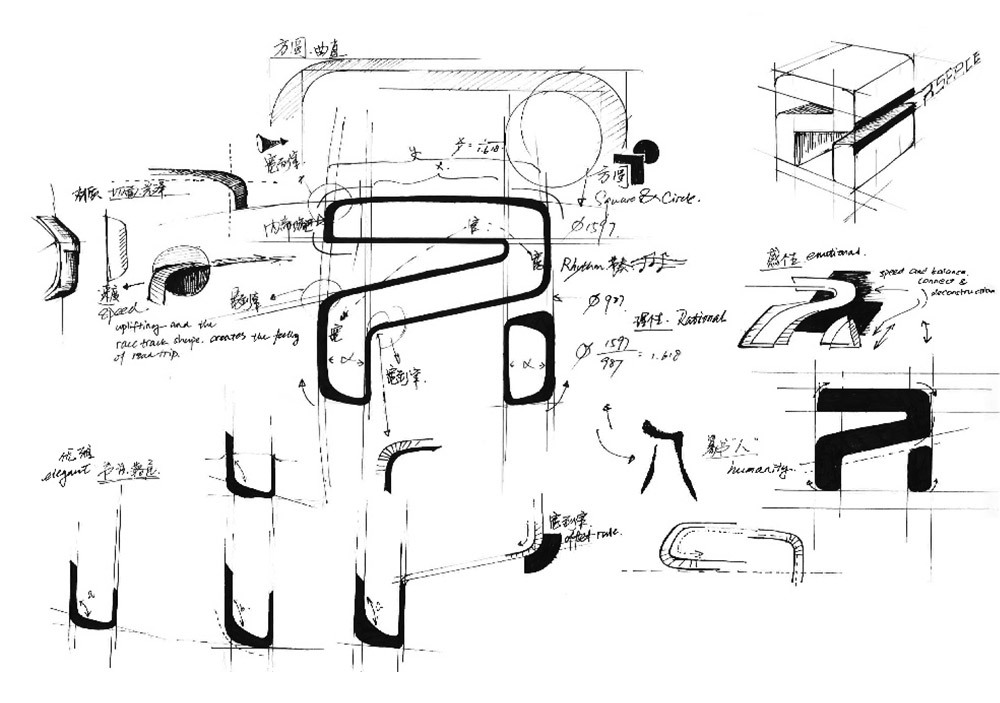
In fact, the new R logo was exposed not long ago. On April 11, Shao Jingfeng, deputy chief designer of SAIC Technology Center, unveiled a new R-mark design manuscript on Weibo. Judging from the manuscript, the new R logo is abstracted by the "R" letter, with rounded corners around the letters, and the overall shape tends to be flattened, which looks more simple and atmospheric. As for the final form, it needs to be officially announced.

Roewe has indeed accelerated the pace of brand reshaping in recent months. On February 29, Roewe officially released a poster of "good things come in pairs" on the official WeChat account. Judging from the poster, the central door knocker of the wooden door uses the existing LOGO outline of Roewe on one side and a circular outline on the other, and predicts that the Roewe brand will adopt a new LOGO style in the near future.

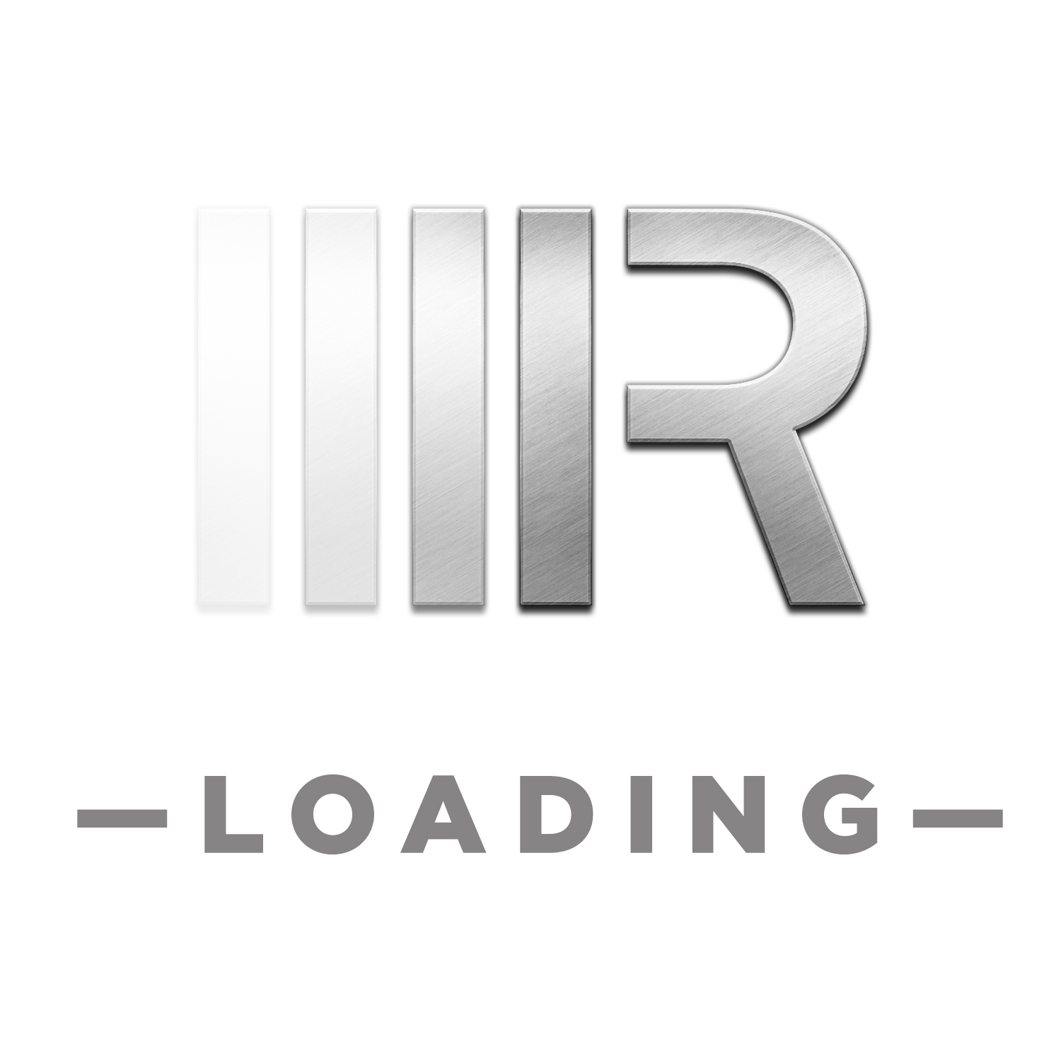
On March 12, Roewe announced that it was stationed in Alipay Ant Forest Public Welfare Forest, and the LOGO of Roewe brand was changed from lion to R mark with metal texture, and the word LOADING (loading) was marked under its LOGO, which further predicted the promotion of brand logo.
In addition, from the design manuscript exposed by Shao Jingfeng, it will not only launch a new R standard, but also optimize the current shield-shaped double lion standard. In terms of color, Roewe's new lion should abandon the long-used red and black background and gold lions and use different shades of colors to highlight the original grid. From the perspective of details, the new double lion logo reduces the complex design of the old logo, optimizes the lion and outline shape, and makes it more flattened. Many netizens said that the optimized logo is younger, personalized and concise, and is also in line with the aesthetic values of current consumers. It is understood that the new double Lion will carry the Roewe RX5 Plus model for the first time.


As for why Roewe launched two LOGO instead of updating the current LOGO? Yu Jingmin, deputy general manager of SAIC, said that Roewe needs to go further after 14 years of development to achieve a more digital and intelligent marketing service experience. The R mark is the beginning of Roewe to a higher end, and the matching market sales and service items will also be upgraded in an all-round way. It is understood that SAIC Roewe will hold a brand conference in May, speculating that the new lion mark and the high-end R standard will be unveiled at the same time.
Welcome to subscribe to the WeChat public account "Automotive Industry Focus" to get the first-hand insider information on the automotive industry and talk about things in the automotive circle. Welcome to break the news! WeChat ID autoWechat
Views: 0
*The comments in the above article only represent the author's personal views and do not represent the views and positions of this website. If you have more insights, please feel free to contribute and share.


© 2024 AutoBeta.Net Tiger Media Company. All rights reserved.
 12
12
 Report