In addition to Weibo, there is also WeChat
Please pay attention

WeChat public account
AutoBeta


2024-11-22 Update From: AutoBeta autobeta NAV: AutoBeta > News >
Share
AutoBeta(AutoBeta.net)01/07 Report--
With the gradual transformation of the automobile industry to the electrified era, it seems that more and more car companies are starting to change the brand LOGO style. After Volkswagen, BMW, Nissan and other car companies have reshaped their brands and launched LOGO, which is younger and more suitable for the digital age. Kia brand also officially announced the launch of a new brand.

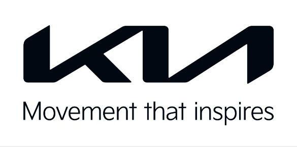
A few days ago, Kia officially announced that the brand will launch the new LOGO. Compared with the LOGO used today, the overall shape has changed a lot. In terms of details, the new LOGO is still interpreted as "KIA" in English, but it is further simplified compared with the previous design, in which the "I" and "A" letters are shared in strokes, while the oval outer ring is removed, and the overall visual effect changes from an ellipse to a rectangle, with smoother lines and a sense of technology.
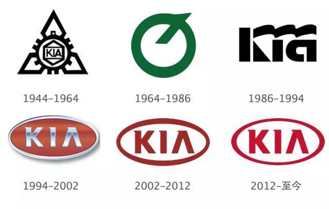
It is worth noting that this is also the biggest change of the Kia brand since 1994. Since its birth in 1944, Kia has changed its logo six times, and the current logo is designed and put into use in 2012. Officials have not announced which models the new standard will be used in, but it is speculated that it will be used first in electric models.

According to the official introduction, the new LOGO is based on three concepts: "Symmetry", "Rhythm" and "Rising".
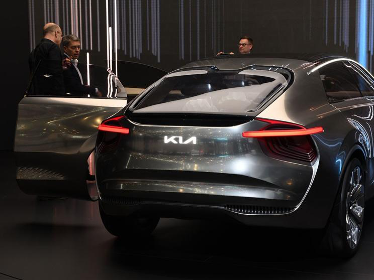
In fact, the new LOGO design first appeared at the 2019 Geneva Motor Show, a concept electric vehicle called the Imagine. However, Park Hanyu, president of Kia Motor Company, confirmed in an interview with South Korean media in February last year that Kia would replace the new LOGO in 2020 and said that the updated Kia LOGO would be officially released in October last year, but somehow extended to this year, perhaps due to the impact of the epidemic.

At the launch of the new LOGO, Kia also announced that it would announce more details of the new brand strategy on January 15. It means that the Kia brand will also begin to transform the electric market with the market.
According to Kia's plan for the next decade, the plan will take "one body and three wings" as the core strategy, and the proportion of new energy vehicle sales will exceed 30% by 2030. Kia will launch 11 pure electric models by 2025, followed by seven more in 2027.
At present, Kia has applied to the Korean Patent Office for the names of a number of electric models, including IK4, EV3, EV6, KENVZ, KNEVS and other new car names.
Replacing the new LOGO will be a big project for every company, but the new LOGO is nothing more than a change in the current inherent image to give consumers a new experience, this time the Kia brand is no exception.
Welcome to subscribe to the WeChat public account "Automotive Industry Focus" to get the first-hand insider information on the automotive industry and talk about things in the automotive circle. Welcome to break the news! WeChat ID autoWechat
Views: 0
*The comments in the above article only represent the author's personal views and do not represent the views and positions of this website. If you have more insights, please feel free to contribute and share.


© 2024 AutoBeta.Net Tiger Media Company. All rights reserved.