In addition to Weibo, there is also WeChat
Please pay attention

WeChat public account
AutoBeta


2024-11-23 Update From: AutoBeta autobeta NAV: AutoBeta > News >
Share
AutoBeta(AutoBeta.net)03/05 Report--
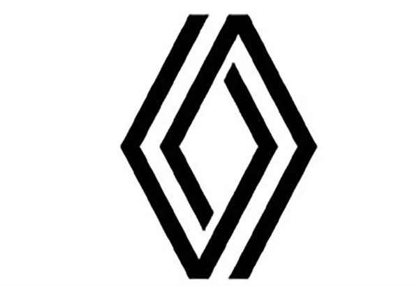
As more and more automakers are replacing LOGO in order to adapt to the electrified age. After the French brand Peugeot replaced the new LOGO, another French brand announced the new LOGO. From the new LOGO point of view, its design is more flat, which is consistent with the design concept of many car companies.

From the current release of the new Renault LOGO, completely bid farewell to the previous 3D design style, the original 3D design diamond design of the LOGO for flattening processing, so that its lines are more obvious, more like a geometric shape.
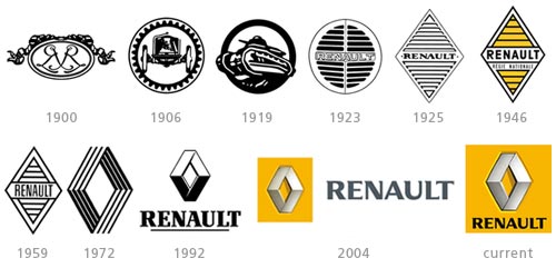
Renault's LOGO adjustment is also the biggest change since 1990. It is understood that the Renault LOGO is a diamond-shaped logo composed of four irregular figures, symbolizing the integration of the three Renault brothers and the automobile industry. But the first logo launched in 1900 in the early days of the company was not the case, but adopted the "double R" logo. It was not until 1925 that the diamond-shaped car logo appeared for the first time. After that, several generations of car labels have only made slight changes in the color details, and the whole has not changed much. It was only in 1972 that a design similar to the current LOGO officially appeared and continues to this day.

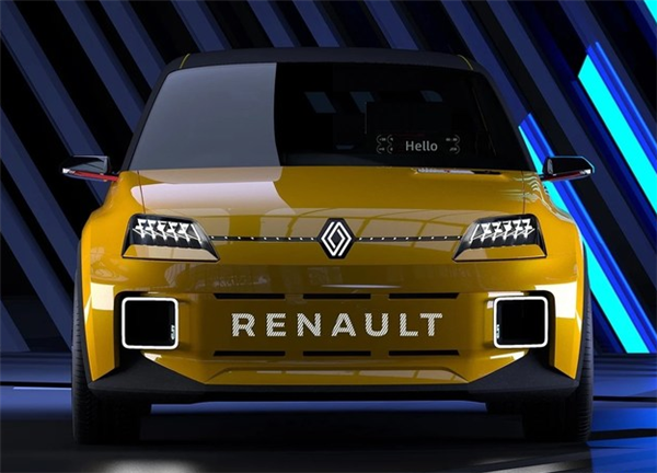
In fact, the design of Renault's latest LOGO was first unveiled in front of the Renault 5 electric car at the Renault Group's Renaulution strategic planning conference earlier this year. With many automobile manufacturers, the new LOGO represents the strategic development direction of the brand in the future.

At present, Renault is accelerating the development and application of electrification-related technologies. This is also the French Renault car is working to further reduce the carbon dioxide emissions of its models. At the same time, in order to avoid paying huge fines to the European Union.
Although the Renault brand announced its withdrawal from the Chinese market last year, it is only a fuel model, and its electrified models will continue to be sold in the Chinese market, which means that the Renault brand is still optimistic about the development of its new energy sector in China.
According to Renault insiders, in the future, Renault's new flat design brand logo will be widely used by the group, including new models, promotional materials, internal documents, dealer network and other places will gradually switch to the latest logo. It just means that Renault will have to make more preparations for replacing the LOGO, which, after all, will be a big project for every company.
Welcome to subscribe to the WeChat public account "Automotive Industry Focus" to get the first-hand insider information on the automotive industry and talk about things in the automotive circle. Welcome to break the news! WeChat ID autoWechat
Views: 0
*The comments in the above article only represent the author's personal views and do not represent the views and positions of this website. If you have more insights, please feel free to contribute and share.


© 2024 AutoBeta.Net Tiger Media Company. All rights reserved.