In addition to Weibo, there is also WeChat
Please pay attention

WeChat public account
AutoBeta


2024-11-21 Update From: AutoBeta autobeta NAV: AutoBeta > News >
Share
AutoBeta(AutoBeta.net)09/28 Report--
Following the change of Peugeot and Renault, another French car brand Citroen also released a new brand logo. According to the plan, the Citroen concept car, which is the first to carry the new brand logo, will be unveiled at the end of September and will be installed in production cars at the end of 2023.

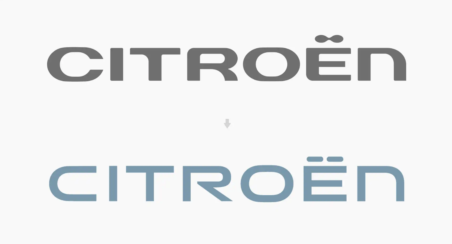
Like Peugeot and Renault, Citroen also pays homage to the classic. From the perspective of the brand-new logo design, the new logo is inspired by the oval double-arrow icon first used in 1919 and has been adjusted to make it more modern, elegant and visualized. the bold double arrows stand in sharp contrast to the soft and slender oval frame. In addition, the Citroen logo has also been updated, the new font retains the hyphenation above the E letter and separates it independently, while the C character has a larger opening, leaving a gap between the R letters.
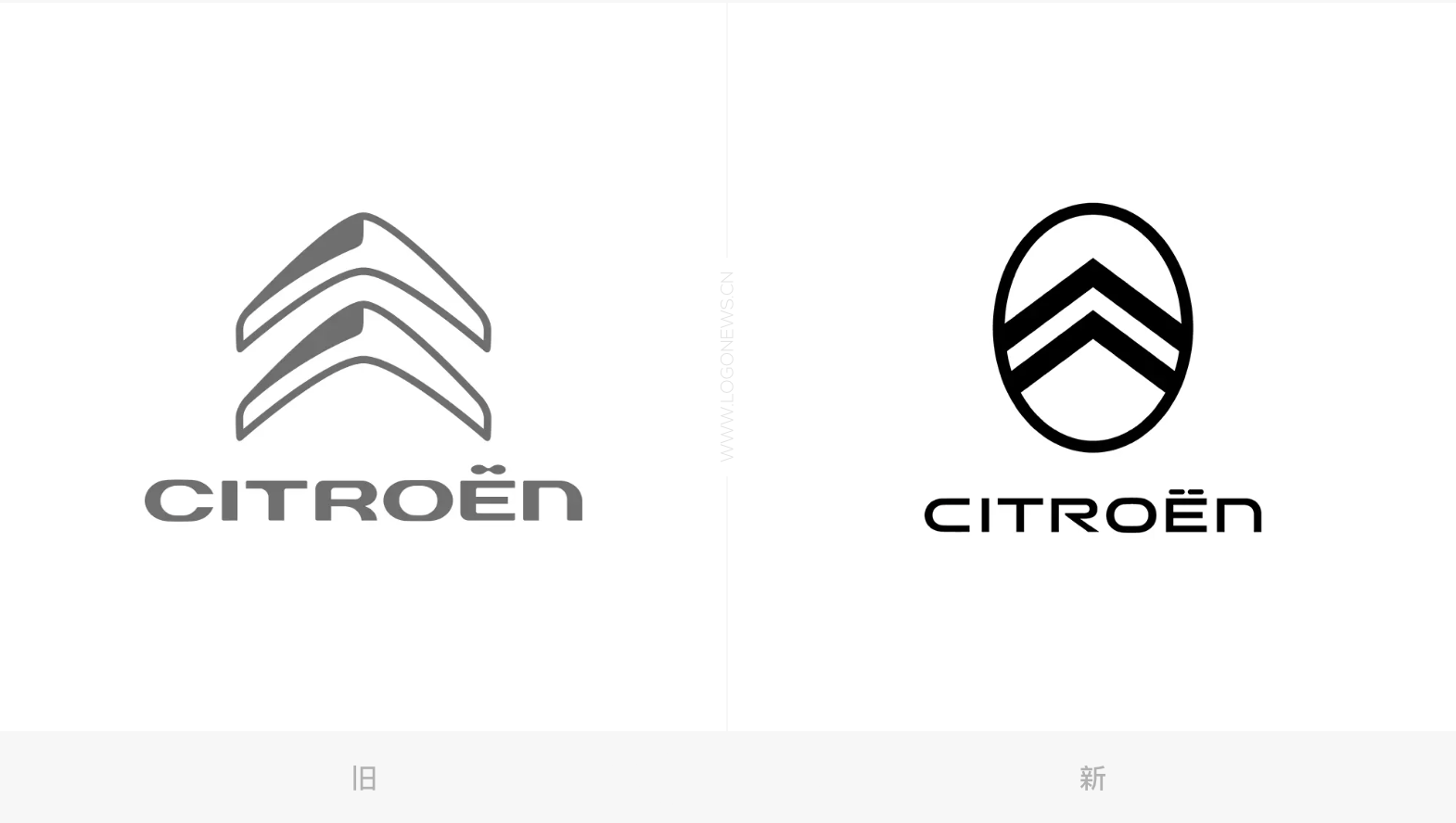
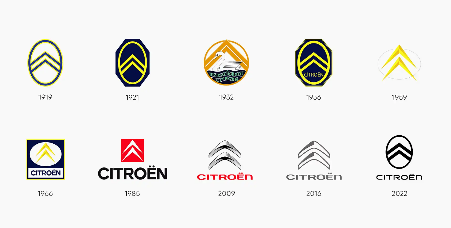
Data show that Citroen has undergone a total of 9 changes. Before founding Citroen, founder Andre Citroen set up a factory to produce herringbone gears in 1901, which is also the main source of inspiration for Citroen's double "diamond" logo. In 1949, after the first transformation, the double "Qing" sign had a sharper angle, and the logo remained in use until 2009. In 2009, Citroen updated the brand logo, and the new logo is still dominated by the word "double", but the outline is more three-dimensional and rounded, with a metallic color as a whole. In 2016, Citroen updated the brand logo, removing the metal texture and relief effect from the original logo, and carried out a flat design. In 2022, Citroen announced the tenth standard change, the overall shape is basically the same as the 1919 version, using flat design to adapt to the development of the times, while paying tribute to the classic.
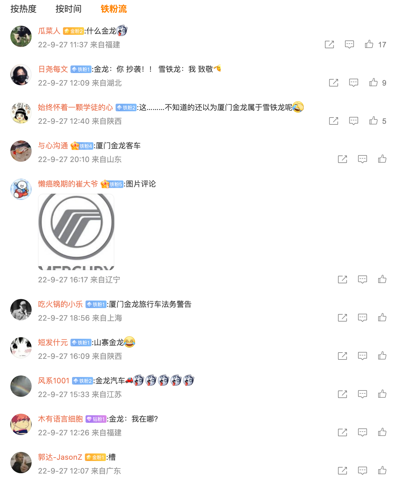
However, the change of the standard also caused some controversy, that is, the new Citroen standard is very similar to the LOGO of Jinlun bus, except for differences in color and shape, its style is basically the same. However, there is no problem of plagiarism. after all, this is the case with Citroen's original brand logo, which is 103 years old.
The new brand logo launched by Citroen is very similar to the previous LOGO released by Peugeot and Renault, which is selected from the historical car logo version and given a new look.
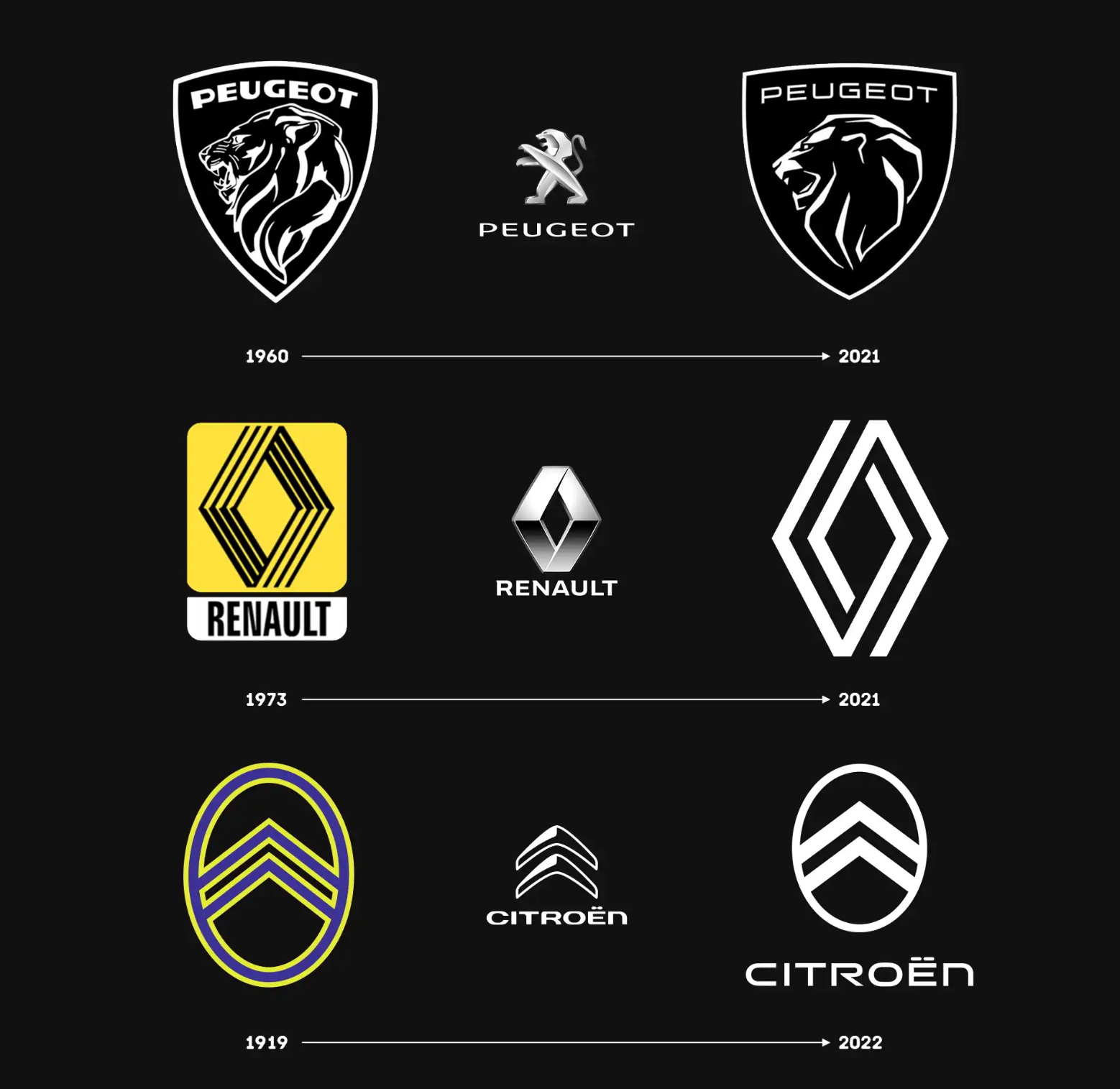
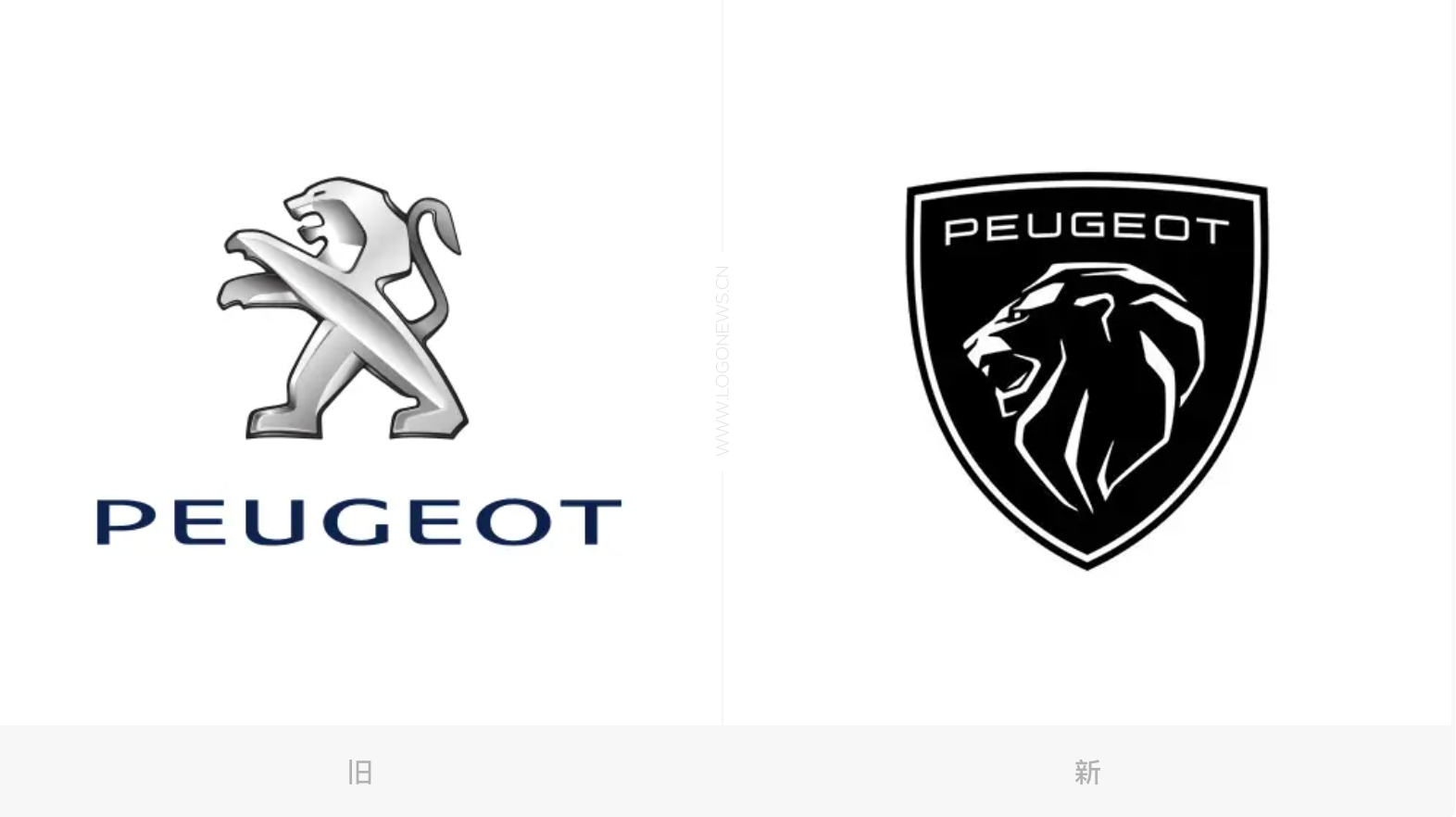
Peugeot was born in 1810. In 1976, Peugeot acquired Citroen and established PSA Group (Peugeot Citroen Group). Peugeot reformed its car logo. The upright lion image is more abstract and the design is more simple, which is the embryonic form of the current Peugeot brand. In 1998, Peugeot reformed the car logo and adjusted it in many details to make the image of the lion more vivid. In 2010, Peugeot updated its LOGO again, incorporating matte and polished bimetal designs into its Lion LOGO, the most widely used logo for Peugeot's models on sale. French carmaker Peugeot announced a brand refurbishment on February 25, 2021, with the iconic Lion logo getting a new look, a lion with only head details embedded in a shield, and a lion shape that is more powerful than the previous edition, and looking back at the history of Peugeot's change, it can be found that the new logo is very similar to that in 1960. It is understood that Peugeot 408 is the first model with a new target, which officially went on sale on August 21, with a price of 10.57-121700 yuan.
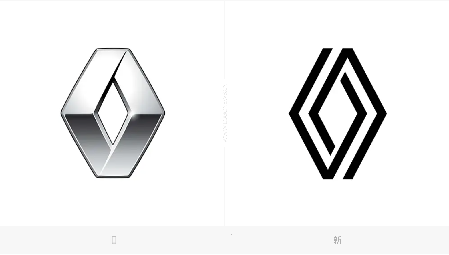
On March 15, 2021, French carmaker Renault released a new brand logo. The new Renault logo adopts a flat design, which changes from the original three-dimensional design style to two-dimensional graphics. The new Renault logo is composed of only two diamond-shaped broken lines. Although there are at least eight major changes to the Renault logo in the history of development, it has not changed since 1925, of which the Renault logo appeared in line form twice between 1973 and 1990. As to why the 1973 version was chosen, perhaps because it has another meaning for the Renault Group. Unfortunately, at present, Dongfeng Renault has been delisted in the Chinese market, and it is expected that it will be difficult to see the new Renault model in the domestic market.
In the past few months, many carmakers have introduced new, mostly flat logos, including BMW, Kia, Nissan, Toyota and Peugeot, Renault and Citroen.

The car logo is not only the image representative of an enterprise, but also the most recognizable feature. Admittedly, brand renovation is more to adapt to the development of the market and the times, brand renewal can bring younger brand image building, to some extent, it will resonate with younger users, younger and more athletic. However, the label change is also a big project, in addition to its models need to be changed, including its dealerships and other assets need to be changed.
Welcome to subscribe to the WeChat public account "Automotive Industry Focus" to get the first-hand insider information on the automotive industry and talk about things in the automotive circle. Welcome to break the news! WeChat ID autoWechat
Views: 0
*The comments in the above article only represent the author's personal views and do not represent the views and positions of this website. If you have more insights, please feel free to contribute and share.


© 2024 AutoBeta.Net Tiger Media Company. All rights reserved.