In addition to Weibo, there is also WeChat
Please pay attention

WeChat public account
AutoBeta


2024-11-18 Update From: AutoBeta autobeta NAV: AutoBeta > News >
Share
AutoBeta(AutoBeta.net)05/14 Report--
With the popularization of new technologies such as electrification and self-driving, traditional automobile manufacturers are gradually transforming to the direction of intelligence and technology. in order to change the inherent impression of users, replacing a new LOGO seems to be a necessary way to better meet the needs of the new era. Earlier, Volkswagen has released a new brand LOGO, and the simple and technological logo shows Volkswagen's determination to transform itself into an electric car.
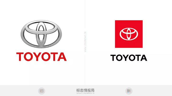
Recently, Toyota officially launched a new brand LOGO, the new LOGO is more concise than before, with a flat style and a rectangular red background, which is more in line with the needs of the times. The "Niutou mark" made up of the classic three rings has not changed.
![1557807361324097.png ]0Z}XYO04[EA2Q]G{YKCMFX.png](https://www.autochat.com.cn/uploadfile/ueditor/image/20190514/1557807361324097.png)
Toyota did not explain the reasons for replacing the new LOGO, but the application of the new LOGO will bring Toyota a new brand image to meet the needs of the future market.
At a press conference in Tokyo earlier this month, Toyota President Akio Toyoda talked about speeding up the development of electrification and autopilot, saying that "a lot of positive investments have been made for the future." He expressed his intention to expand cooperation with IT enterprises and other different industries in the future to enhance competitiveness.

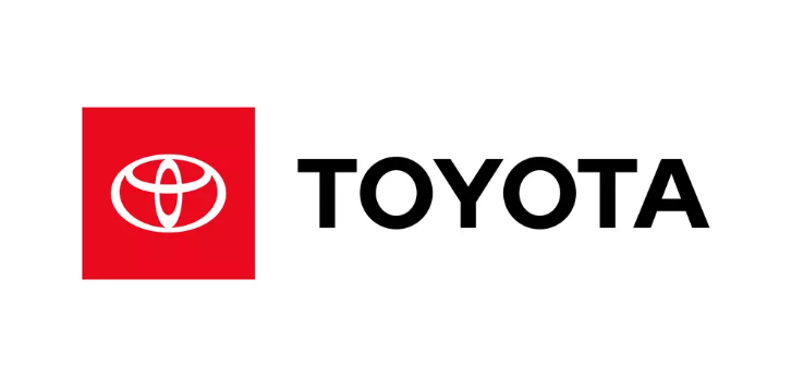
Toyota this time replaced a new group of brand LOGO, including a variety of styles. The advertising we usually see will be the first LOGO style, with "TOYOTA" in black font and the Toyota logo with a red background; the second style represents the symbol of the Toyota brand and company, without a red background; the third style is the TOYOTA capital alphabet, Toyota's special LOGO, which can be used in a wide range of scenes and is also a classic symbol of Toyota.
![1557807389635787.png ]FXQF~6NIL}Z)HPZ]%JY6FT.png](https://www.autochat.com.cn/uploadfile/ueditor/image/20190514/1557807389635787.png)
In addition, Toyota's previous "Moving Forward" slogan has all been replaced with a new unified slogan of "Let's Go Places".
Toyota's "Niutou" and "TOYOTA" logos are signs of quality, reliability and durability in the eyes of many consumers, as well as the brand image created by Toyota for many years, and the popular application of the new LOGO may represent the transformation of Tian to the needs of a new era.
Welcome to subscribe to the WeChat public account "Automotive Industry Focus" to get the first-hand insider information on the automotive industry and talk about things in the automotive circle. Welcome to break the news! WeChat ID autoWechat
Views: 0
*The comments in the above article only represent the author's personal views and do not represent the views and positions of this website. If you have more insights, please feel free to contribute and share.




© 2024 AutoBeta.Net Tiger Media Company. All rights reserved.